
Waddington's Beautiful Britain playing cards
Waddington's had its origins in the nineteenth century when it was started as a small printing business with most of its trade coming from the theatre. From 1905 the firm expanded and although John Waddington, one of the founders, left in 1913 the company retained his name. As it expanded the company added playing cards to its range during the early 1920s and quickly came up with the idea of seeking sponsors to pay for advertising space on the card backs. Many different ranges of cards were to be produced over the years, but the first to be sponsored was the 'Beautiful Britain' series in 1924.
It may not be commonly realised today, but up until 1960 all decks of playing cards printed and sold in the United Kingdom were liable to tax under the Stamp Act of 1765. Packs bore a paper seal, or an overall wrapper, to show that the duty had been paid and the often elaborate Ace of Spades carried the name of the printer which also served to indicate that the tax had been paid.
GWR sponsorship 1924-5
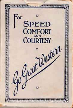
The Great Western railway were the first sponsors of the new 'Beautiful Britain' series of playing cards which enabled well printed playing cards to be sold at a very competitive price benefitting both the GWR and Waddington's. This initiative was very successful and contributed to Waddington’s rapid growth in the playing card field and to them becoming competitors to the long established playing card producers of De la Rue. Every card in each pack carried the same illustration on the back, being one or two monochrome photographs printed either in blueish green or sepia, and the boxes bore the message For Speed Comfort and Courtesy - Go Great Western. Unlike the postcards, jigsaws and other publications sold by the GWR, these playing cards did not form part of its 'official' merchandise and were always sold by Waddington's, being one of their own products. The Great Western Railway withdrew their sponsorship in 1925.
There were three different backs illustrating a single place of interest, and three different backs each illustrating two places of interest. We have not been able to find examples of all twelve colour/image combinations, and it is possible that not every combination was produced, but those in our collection can be seen below. It looks likely that the GWR supplied all the photographs used as they are either the same, or similar, to those used on the GWR published postcards at the time.
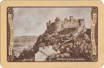
Harlech Castle, N.Wales
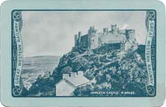
Harlech Castle, N.Wales
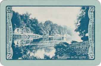
Maidenhead on the Thames
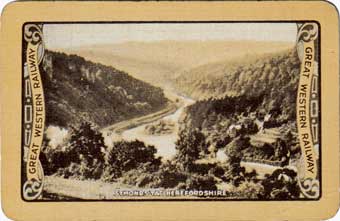
Symonds Yat, Herefordshire
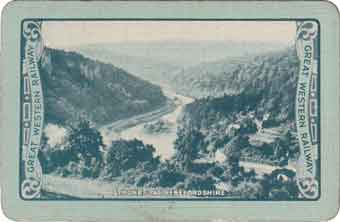
Symonds Yat, Herefordshire
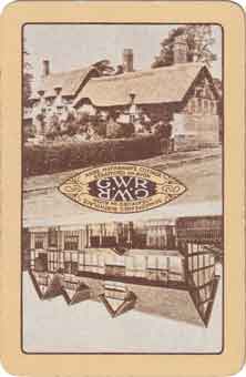
Anne Hathaway's Cottage
Shakespeare's Birthplace, Stratford on Avon
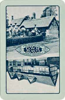
Anne Hathaway's Cottage
Shakespeare's Birthplace, Stratford on Avon
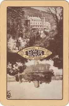
Fishguard S.Wales
Pembroke Castle, South Wales
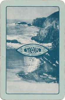
Lands End, Cornwall
Oddicombe Beach, Torquay
LNER sponsorship 1926-9
The London and North Eastern Railway took over from the GWR in 1925 and continued their sponsorship until 1929. This resulted in a total redevelopment of the design with the LNER sponsoring a range of new designs by artists such as Austin Cooper and Tom Purvis. These were printed in full colour with ornamental panels at each end. Later, a second more sylised type of design was produced, also in colour, but with the railway company name inside a plain black border at each end of the card. In 1927 the expensive colour images reverted to monochrome designs once more in sepia or blue-green and also blue. These later designs were from etchings, mostly by Frank Henry Mason, but also Fred Naylor, Sidney Lee and Frank Newbould. These designs retained the railway company name in solid borders at each end with the long borders printed either as a thinner solid line or a dotted line. Many different illustrations were used, all depicting locations served by the LNER and we hold a small selection in our collection which can be seen below. Two slightly different versions of the ace of spades were produced for the LNER, with the more elaborate version having a scroll at the base of the spade motif with the words Kings Cross for Scotland shortest and quickest.
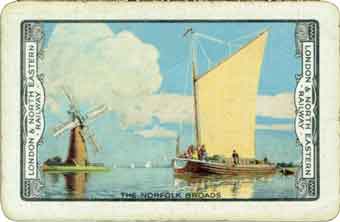
The Norfolk Broads
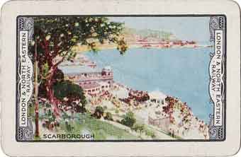
Scarborough
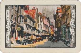
York
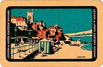
Cromer
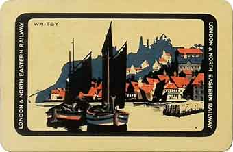
Whitby
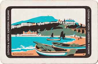
Scarborough
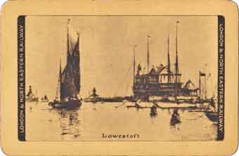
Lowestoft
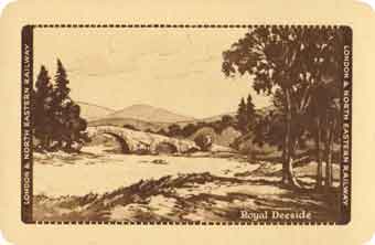
Royal Deeside
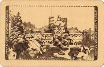
Harrogate
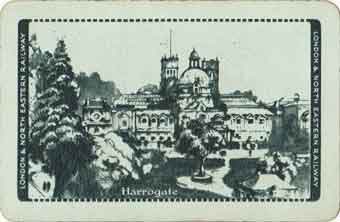
Harrogate
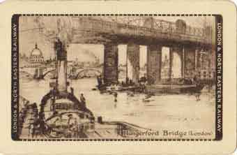
Hungerford Bridge (London)
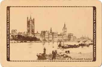
Houses of Parliament (London)
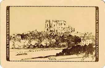
York
1930 onwards
Nobody took over when the LNER ceased sponsoring the cards, but Waddington's continued to produce the 'Beautiful Britain' series from 1930 right up until the late 1950s or early 1960s. Photographs were once again used for illustration and the heavy end borders bearing the name ‘London and North Eastern Railway’ disappeared from the back with the dotted border being extended with rounded corners around the whole image which was printed in sepia, blue-green, lilac or a reddish pink. In later editions the border became heavier with more pronounced dashes. We have come across packs from this period containing the special LNER ace of spades, even though they were no longer supporting the series. The final iteration of the design took place in about 1938 when the dotted borders were changed to a border on two sides only, comprised of one thick and one thin line. These lines were either brown/black or blue-green, depending upon the colour of the image. The final years saw these lines being printed in red, irrespective of the card colour.
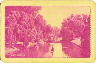
Cambridge
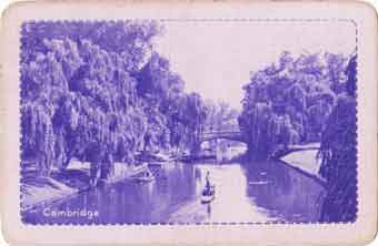
Cambridge
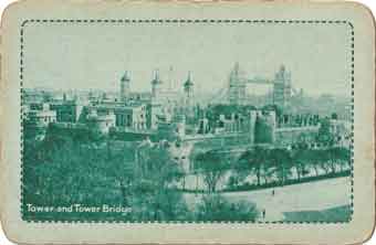
Tower and Tower Bridge
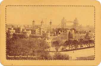
Tower and Tower Bridge
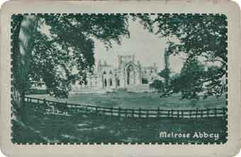
Melrose Abbey
1938 onwards
The final iteration of the design took place in about 1938 when the dotted borders were changed to a border on two sides only, comprised of one thick and one thin line. These lines were either brown/black or blue-green, depending upon the colour of the image. The final years saw these lines being printed in red, irrespective of the card colour.
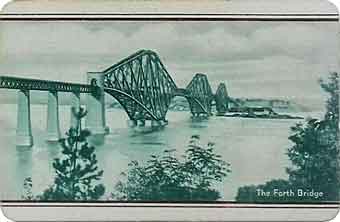
The Forth Bridge
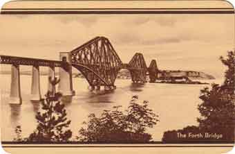
The Forth Bridge
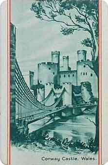
Conway Castle, Wales
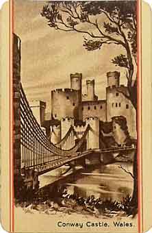
Conway Castle, Wales
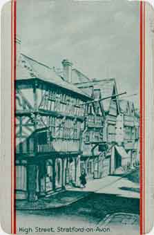
Stratford-on-Avon
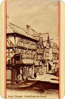
Stratford-on-Avon
Ace of Spades
When the LNER first started to sponsor the cards, Waddington's continued to use their own standard design Ace of Spades that had been part of the GWR sponsored packs.Two slightly different Ace of Spades designs were later introduced, both incorporating the company shield and scroll with the company name. Whilst it is not known for certain when each was in use, we believe the more intricate one bearing the words King's Cross (London) for Scotland shortest & quickest in a decorative scroll on the 'stem' of the design was the later one as examples also occur within our collection with non-LNER card backs, possibly old stock being used up by Waddingtons. This card eventually reverted to the very original 'standard' design. Magnified versions can be seen by clicking or tapping a thumbnail image.

Waddington's Beautiful Britain
'standard' Ace of Clubs

LNER Ace of Clubs

LNER Ace of Clubs
with promotional message
Packaging
GWR sponsored boxes had printed on the front For Speed Comfort and Courtesy - Go Great Western with the words 'Go Great Western' in a flowing script, all surrounded by a decorative border all printed in one colour. The backs of the boxes were plain and had Beautiful Britain printed in italics on the base. Both long edges were the same, bearing the branding John Waddington Limited. Licensed Playing Card Manufacturers, Leeds and London in cursive italics surrounded by a plain frame. There would seem to have been no indication as to which particular cards were contained in the packaging.
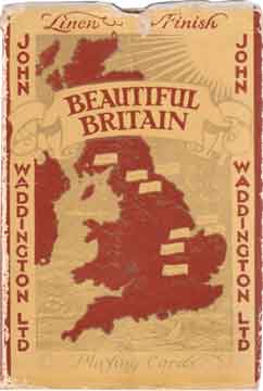
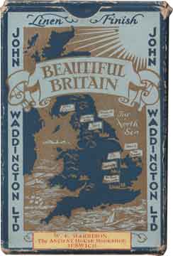
The early LNER sponsored boxes were almost identical to those of the GWR having on the front Waddington's "Beautiful Britain" Playing Cards with the title of the image used on the backs of the cards underneath in a flowing script, all surrounded by a decorative border. The printing was again in a single colour with the front and back being of identical design. The boxes did not to carry any reference to the railway company. Each different card back therefore required its own packaging and the boxes were later standardised with a playing card being attached to the outside showing the picture used on the cards inside. These later coloured boxes were rather more elaborate and had a map of Great Britain on the front with a series of flags indicating places of interest within the large operating area of the LNER but there was still no mention of the sponsoring railway company. It would appear that Waddingtons continued to use this packaging unchanged for many years after the LNER ceased to sponsor the cards at the end of 1929.
GWR packaging
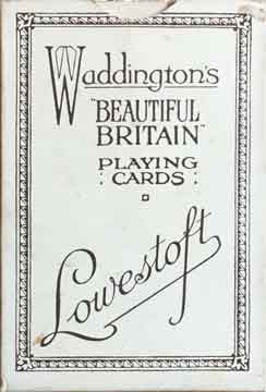
LNER Lowestoft pack
Waddington's Forth Bridge pack
Waddington's Melrose Abbey pack

The packaging was later modernised with cleaner and brighter designs, all still bearing the maker's name and the words Beautiful Britain. We don't know about the GWR sponsored cards, but the monochrome LNER and the later Waddington's own sets were also sold in twin packs. Both decks of cards in such sets would have used the same monochrome image on their backs, but each would have been printed in a different colour. Possibly only used in these twin packs, another form of pack can be found which had an oval window on the front revealing a card back rather than having one on the outside. Twin packs had an example of each card back stuck to the base of the outer box..
Full size images of the twin pack can be seen by clicking or tapping the thumbnail image.Promotional packaging
Many companies used both packaging and the design of playing card backs to promote themselves, and it is a method of marketing which is still in use today. Whilst looking for cards to add to our collection we came across several packs promoting railway bookstall operators
Click or tap to reveal our hidden page about railway bookstalls
. Needless to say, being of railway interest, they were also added to our playing card collection.
